
3 Things I’d Fix First on Your Website (If I Had 30 Minutes)
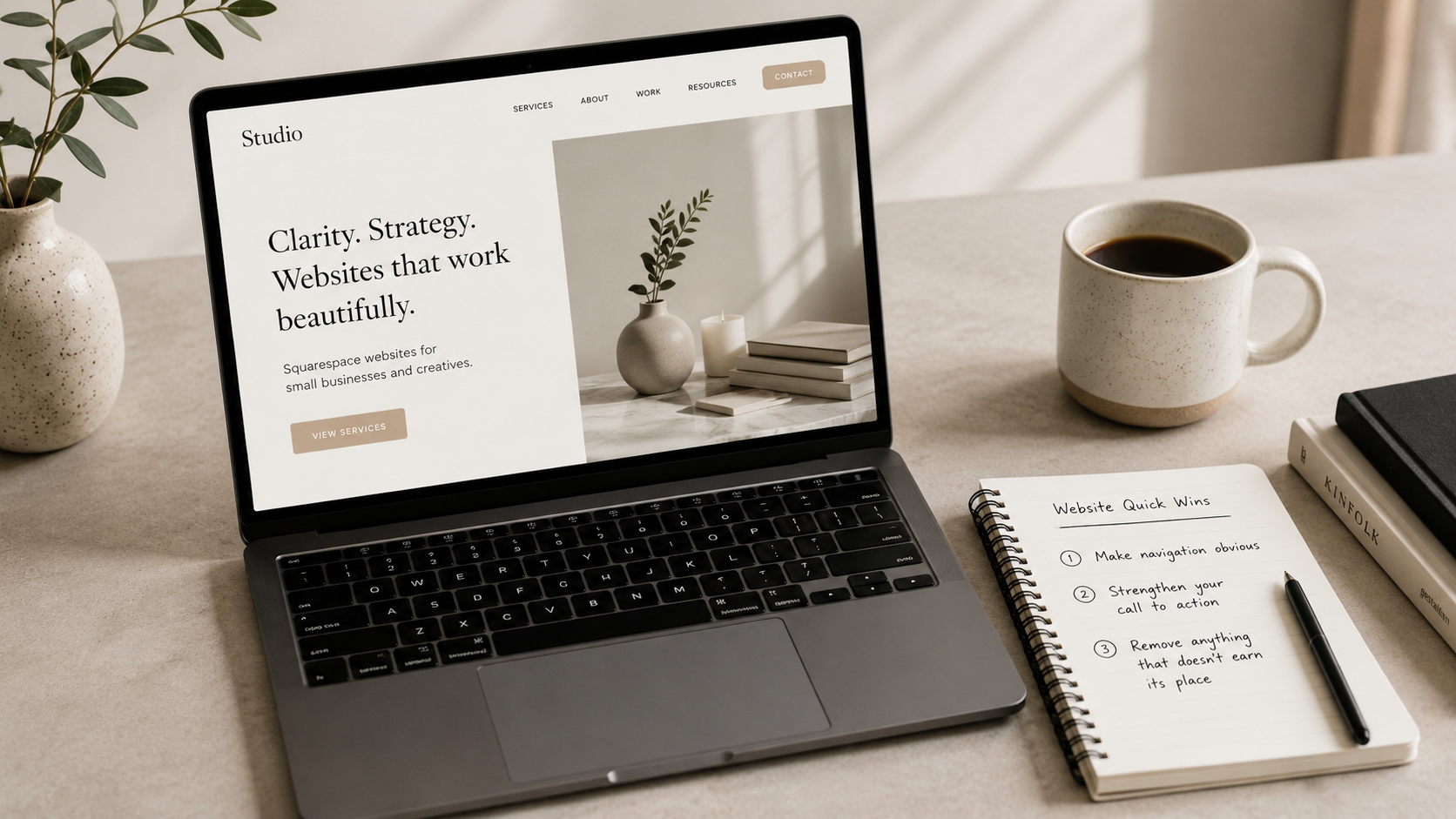
If I had half an hour to improve a website, I wouldn’t start redesigning anything.
I wouldn’t change fonts, rebuild pages, or obsess over colours.
I’d focus on clarity.
Because in most cases, websites don’t fail because they’re badly designed. They fail because they’re unclear, cluttered, or not guiding the visitor in the right direction.
Here are the first three things I’d fix.
1. Make the navigation obvious
Most websites don’t need more pages. They need better direction.
If someone lands on your site and has to think about where to go next, you’ve already lost momentum.
I would check:
Is your main menu simple and predictable?
Can someone instantly find your core services?
Are there too many options competing for attention?
If everything feels important, nothing stands out.
A good navigation system should quietly guide people, not make them think.
2. Strengthen your main call to action
Most websites either hide the next step or offer too many of them.
If you have multiple competing buttons like “Learn more”, “View services”, “Contact”, “Download”, your visitor is forced to pause and decide. That pause often becomes exit.
Instead, I’d:
Choose one primary action per page
Make it visually consistent
Repeat it in logical places (not constantly, just predictably)
Your website should feel like it knows where it’s going.
Not like it’s waiting for the visitor to decide everything.
3. Remove anything that doesn’t earn its place
This is the quickest win and usually the hardest for people to do.
Most websites accumulate content over time:
extra sections, repeated messaging, decorative blocks, filler text.
If something doesn’t do at least one of these, it needs to be questioned:
Does it help someone understand what you do?
Does it build trust?
Does it guide them to take action?
If the answer is no, it’s probably just noise.
A simpler page almost always performs better than a busy one.
The simplest shift
If your website feels slightly “off”, it’s rarely a design problem.
It’s usually a clarity problem.
And clarity is one of the fastest things you can fix.
You don’t need a rebuild. You need decisions.
Wondering how does a Squarespace Website In A Day work? Find out what happens before, during and after your dedicated website day, including preparation, finishing touches and follow-up support.
A good website doesn’t need to be complicated to be effective. In fact, keeping things simple can make your website easier for visitors to navigate and much easier for you to manage. Here’s why less really can be more when it comes to your website.
Is Squarespace a good choice for your small business? Here’s what makes it a good fit for many small businesses, plus when another platform might be more suitable.

How much does Squarespace really cost? Here's a straightforward guide to Squarespace pricing, plans, extra costs and choosing the right option for your business.
Choosing a domain name doesn’t have to be complicated. Learn how to select a domain that supports your brand, is easy to remember, and works long term.
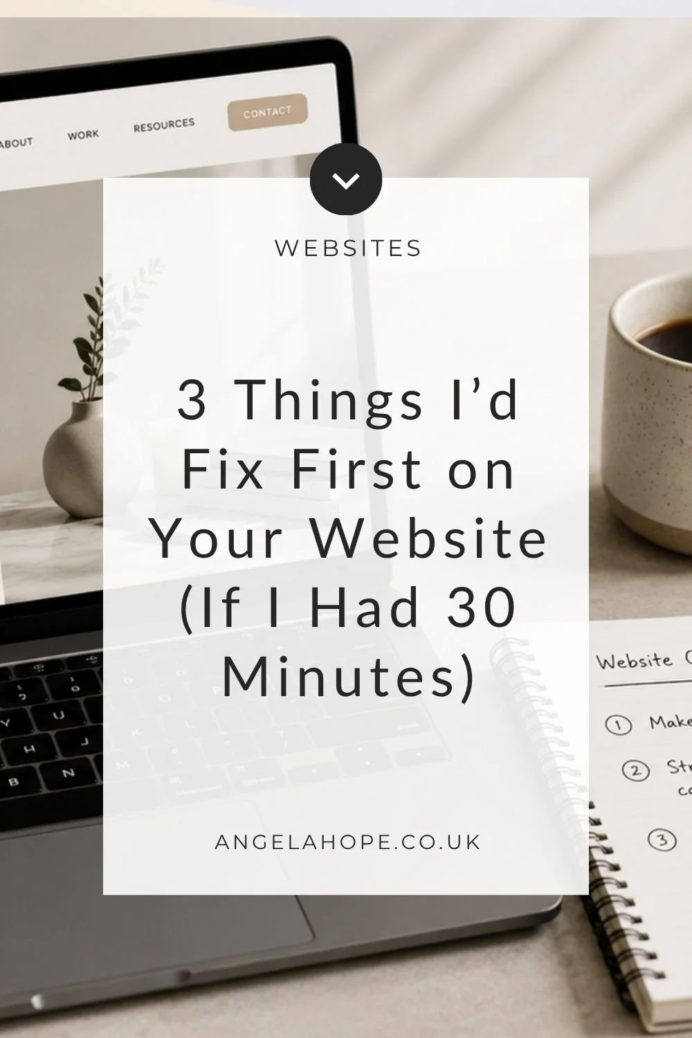
If your website feels “fine” but not quite effective, a few small changes can make a noticeable difference. Here are the three fixes I’d make first if I only had 30 minutes to improve any website: simple, practical, and focused on clarity, navigation, and conversions.

Feeling like your website is cluttered or overwhelming? Discover 5 practical ways to simplify your site, improve user experience, and make it easier for visitors to take action.

A clean Squarespace backend means less stress, faster updates, and a smoother workflow. Here’s how to tidy up your site in just 4 simple steps.

Want your website to feel cohesive and intentional, even if you can’t afford a designer? Learn how to use Pinterest to gather branding inspiration, explore colours and fonts, and discover the visual style that suits your small business.
Writing website copy often feels harder than designing the website itself. You know what you do, who you help, and why it matters — but turning that into clear, confident words can feel overwhelming. The truth is, your website copy doesn’t need to be perfect. It just needs to be clear, structured, and written with purpose. In this post, I’ll walk you through a simple, DIY approach to writing website copy without overthinking it.

Not every web designer works the same way — and that’s a good thing. In this post, I share what I don’t do, why I choose simplicity over complexity, and how a fuss-free approach can make your website easier to manage and less stressful.
Get your website ready for the festive season with simple, actionable tweaks. These quick wins will improve your site before year-end without the stress.
If you’ve been wondering “Can I do SEO on my own website?”, the answer is yes. This post breaks down the basic, fuss-free SEO steps every DIY website needs to start getting found on Google.

Building a website in a day might sound like magic — but with the right prep, it really can happen. One of the reasons my clients love my fuss-free approach is because it’s quick, collaborative, and cuts out the faff. But for everything to run smoothly, there are a few things I’ll need from you ahead of time.

When you’re building (or refreshing) your website, it’s easy to get caught up in colours and fonts — but small decisions like what to include in your navigation bar can have a surprisingly big impact on how visitors move through your site.

Squarespace gives you beautiful design tools — but if your site feels cluttered, overwhelming, or hard to navigate, even the best template won’t help. Simplifying your site can transform it from confusing to compelling. Here's how to streamline your Squarespace website for a smoother, more enjoyable user experience.

If you're a small business owner, your time is precious—and chances are, you're already juggling enough without spending hours manually replying to emails, sending freebies, or scheduling calls. The good news? Your Squarespace website can do a lot of this work for you — automatically.

A well-designed Squarespace website (or any website) can be a powerful tool for your business, but small mistakes can make a big impact on user experience and conversions. Here are five common mistakes and how to fix them.

A website is one of the best investments you can make for your business, but what if you’re not quite ready to afford one? The good news is you don’t have to put your business on hold. There are plenty of ways to establish an online presence and start attracting customers while you save up for a proper website. Here are some practical, low-cost alternatives to get you started.
 Hi I'm Angela
As a Squarespace web designer and digital systems expert I am passionate about keeping life (and work) as simple as possible.
Work With Me | Blog | Email