The Power of Minimalism in Website Design
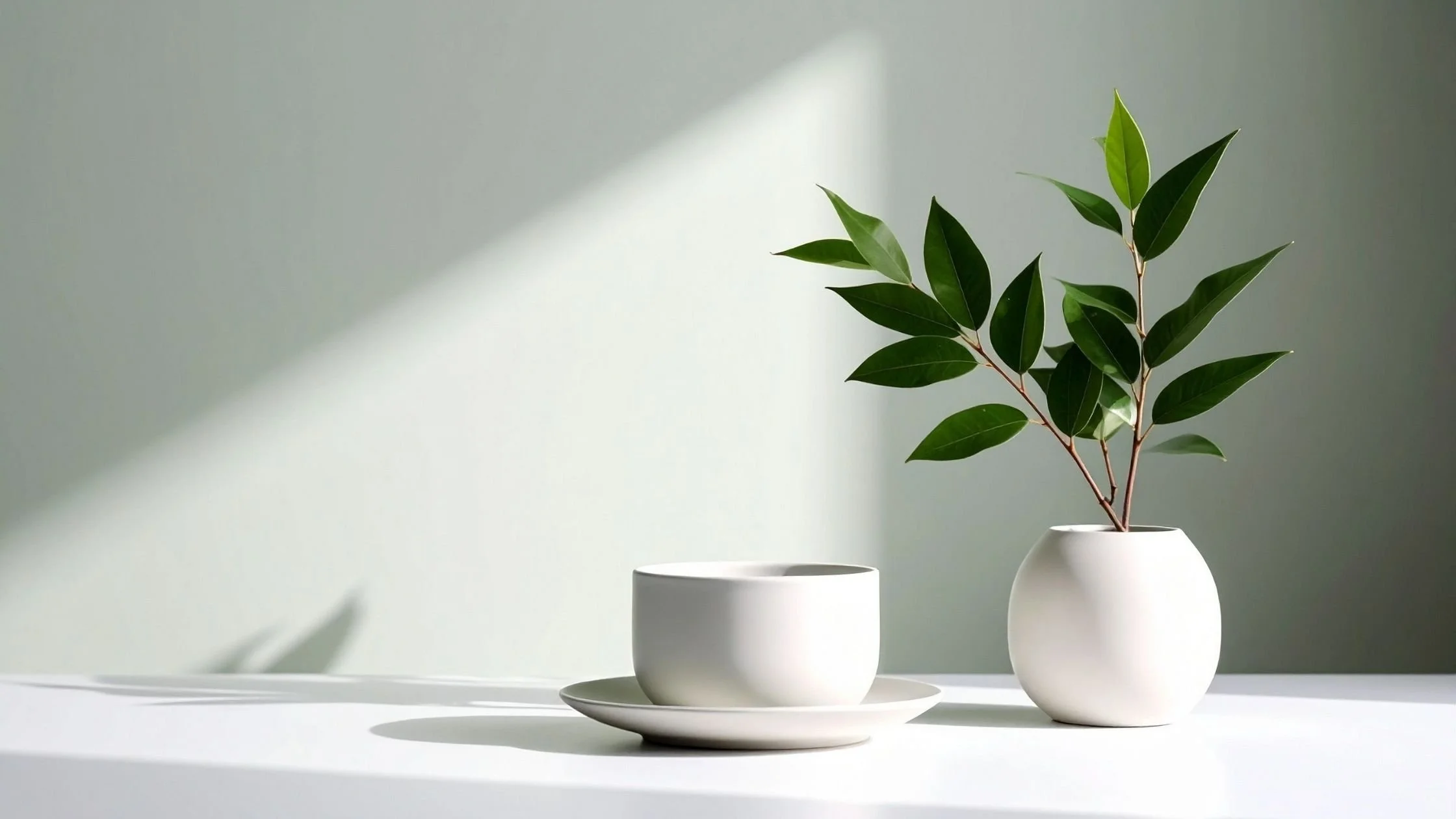
Minimalism in website design is often misunderstood as a purely visual style. Clean layouts, lots of white space, pared-back colour palettes. While those elements are part of it, minimalism is really about clarity and intention.
At its core, it is a way of designing that prioritises what matters and removes what does not.
In a digital space where many websites try to say everything at once, minimalism offers something different. It creates focus. It allows your message to land clearly. And it helps your website do what it is actually there to do, which is guide visitors towards a specific action.
If your website feels cluttered, confusing, or harder to manage than it should be, a more minimalist approach can make a significant difference.
What minimalist website design really means
Minimalism is not about having less for the sake of it. It is about being deliberate.
Every element on your website should have a clear purpose. If it does not support your message or help the user move forward, it does not need to be there.
This often results in:
Simpler page structures
Clearer messaging
More intentional use of space
Fewer competing elements
Rather than asking “what else can I add?”, the question becomes “what can I remove without losing meaning?”
That shift alone can completely change how your website feels.
Improving user experience through simplicity
One of the biggest advantages of a minimalist website is how much easier it is to use.
When someone lands on your site, they are usually scanning rather than reading in detail. They are looking for quick reassurance that they are in the right place, and clear direction on what to do next.
If your pages are crowded with information, multiple calls to action, or overly complex layouts, it creates friction. Visitors have to work harder to understand what you offer, and many simply will not.
A minimalist approach reduces that friction.
By simplifying your layout and focusing on one clear goal per page, you make it easier for visitors to move through your site with confidence. Navigation becomes more intuitive. Content is easier to digest. Decisions feel simpler.
This does not just improve the experience. It directly impacts how effective your website is. When people feel at ease, they are far more likely to stay, explore, and take action.
Reducing build time and ongoing costs
There is also a very practical side to minimalism that is often overlooked.
More complex websites take longer to design, longer to build, and more time to maintain. Extra pages, custom features, and layered functionality all increase the level of work involved.
For many small business owners, this leads to projects that drag on or websites that feel like they are never quite finished.
A more minimalist approach keeps things focused.
With fewer pages and clearer structure, you can:
Launch more quickly
Avoid unnecessary features
Reduce the need for ongoing tweaks and fixes
It also makes your website easier to manage day to day. Updates take less time. Content is simpler to maintain. You are less likely to feel overwhelmed every time you log in.
This is particularly valuable if you want a website that supports your business without constantly demanding your attention.
Creating a stronger, more cohesive brand
Minimalism also plays an important role in how your brand is experienced online.
When a website is busy or inconsistent, your message can become diluted. Visitors may leave with a vague sense of what you do, but without a clear understanding of who you are for or why it matters.
A minimalist design gives your brand space to come through more clearly.
By limiting distractions, you can highlight the elements that define your brand. Your messaging becomes more direct. Your visual identity feels more consistent. The overall experience feels calmer and more considered.
This is particularly effective for brands that value simplicity, clarity, and a more intentional way of working. The design itself reinforces those values, rather than competing with them.
What minimalism is not
It is worth saying that minimalism does not mean stripping everything back to the point where your website feels empty or lacking in personality.
A minimalist site can still feel warm, distinctive, and engaging.
It might include strong typography, carefully chosen imagery, or subtle design details that add character. The difference is that these elements are used with purpose, rather than added for the sake of filling space.
In other words, minimalism is not about doing less overall. It is about doing the right things, and doing them well.
A simpler way forward
If your current website feels like it is trying to do too much, the answer is not always a complete redesign. Often, it starts with refinement.
Looking at your site through a minimalist lens might involve:
Simplifying your navigation so it is easier to follow
Reducing the number of calls to action on each page
Editing your content so the key message is clearer
Giving sections more space so they are easier to absorb
These are relatively small changes, but they can have a significant impact on how your website performs and how it feels to use.
Minimalism in website design is not about following a trend. It is about creating something that works.
When your website is clear, focused, and easy to navigate, it supports your business in a much more effective way. It allows your message to come through, helps your visitors take action, and makes the whole experience feel simpler for everyone involved.
And in most cases, simpler really is better.